ROLE: SENIOR UX/UI DESIGNER


Zigzy is a mortgage company that shows you how to navigate today’s complex housing market – from buying a home with cash to finding the right real estate agent and securing a mortgage. As a new brand under the New American Funding umbrella, the stakeholders wanted a website that is targeting millenials who feel the burn of the housing market, with the help of their "Rich Uncle Zigzy".
Worked closely with the Executive V.P. of Marketing to understand the scope and expectations of the product. The team relayed to me that they wanted a "modern yet trusting, corporate style website". First, using wireframes, the layout was designed and approved before moving onto the high fidelity mocks, and eventually including all approved copy. Phase 2 is currently in the works with added features.

Like most mortgage companies, Zigzy relies on lead generation through its online form. Using the metrics from the parent company's forms, we wanted to avoid any issues we currently have, which includes a high drop off rate when users must enter their personal data.
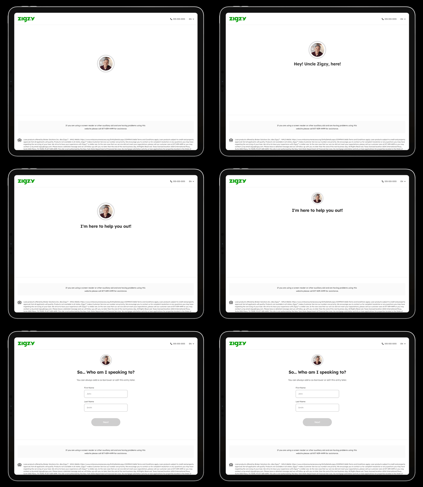
Zigzy's mascot, "Rich Uncle Zigzy" was really put to use in these forms. I wanted to convey the feeling of a conversation throughout the lead gen process. Every question was made to feel like a one on one between the user and "Uncle Zigzy". The largest drop off in New American Funding's forms was the name question. For Zigzy, I unconventionally placed the personal question at the beginning of the form to make it seem like the start of a conversation. "Hey! Uncle Zigzy, here! I'm here to help you out! So...Who am I speaking to?"
